Seeing the Structure Makes for a Better Design Process
Hi, if you’re a total Information Architect virgin, then we recommend you watch this lovely primer. Otherwise, read on!
We’ve all been there… at the top of a project with a big unfamiliar website we need to get into and make sense of. A client may know every minute detail of how it’s structured and refer to it with jargon that sounds like it’s in an alien language. We may just have a glimmer of an understanding. We must do all that we can to get up to speed pronto.
Clicking around may give a hazy idea of a site’s hierarchy. Sitemaps remove those impediments to comprehending a design. We see the scope and structure with perfect clarity. There’s no reason to fumble around and have to try and figure out a website’s organization on your own, when sitemaps remove the barriers to understanding.
Start with a visual sitemap
But who has the time to manually put together a sitemap when there’s so much other work to be done? Sure, you could scribble one out. Or even skip this step entirely. Nobody has time to trudge through every page and diagram its relationships to others. And you’re probably going to make mistakes if you do. We’re only human, and it’s easy to mess up with so many moving parts to keep track of.
VisualSitemaps takes care of this step so you don’t have to with our app auto-generating a complete and exact sitemap. What you get is a snapshot of the /directory/ structure, outlining the organization of the pages within the web design. Instead of spending hours and hours piecing a sitemap by hand, you get a gorgeous one in an instant.
If you’re dealing with a website that’s been around for a while, having gone through multiple iterations, and worked on by many people, it’s easy for its scope to be like a garden that’s overgrown with weeds. Your job is to cut down what’s not needed, to give it order, and give the content room to breathe.
When you don’t have a website blueprint to work from, your choices are based on limited information. This leads to disordered information architecture, wonky navigation, and a frustrating user experience.
Sitemaps show you the organization and relationships between pages. All of the relationships are visible. You can then analyze this gridwork and create more efficient avenues for your users.
A visual sitemap lets you see how you can streamline a website’s organization. The main navigation, secondary navigation, and all of the branches that extend down are clearly illustrated. You can figure out where to split up content, combine it, and put an important page that may be buried in a new place that’s more accessible. You can flatten complicated page trees into something more manageable. Visual sitemaps give you the power to make informed design choices.
Flat versus deep: two different ways to structure
Depending on the content and scope, a website may have a more flat hierarchy or one that goes deeper with many branches. The general rule is that you don’t want to have content that takes a priority to be hidden underneath levels of navigation. Flat website taxonomies are best suited when there are straightforward categories that people can immediately identify. Looking at this VisualSitemaps’ representation below from Blue Apron shows that their website has a flat organization. All of the most important pages are no more than two levels deep.
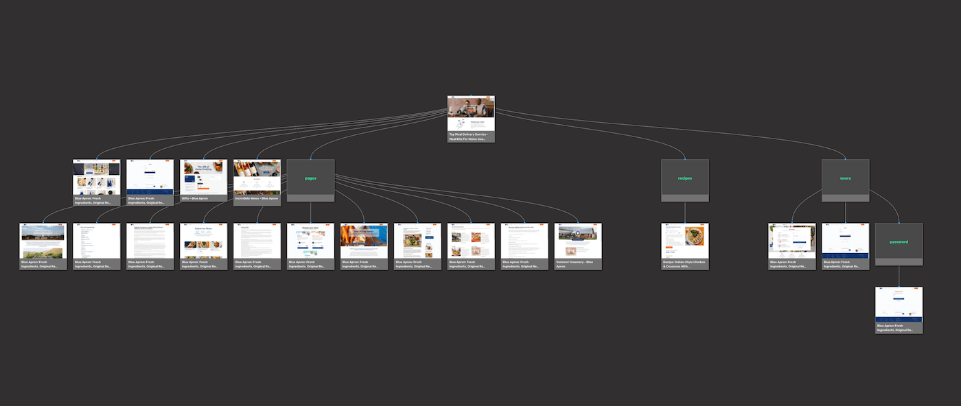
Blue Apron’s offerings are distinct, leading to a flat, straightforward site structure. But for businesses that may have multiple categories of products, a deeper hierarchy will lead people on more focused paths in finding what they’re after. Let’s take Burton for example. Their primary product are snowboards, which can be subdivided into a number of categories depending on the type of riding someone wants to do. But snowboards aren’t their only products, and they offer multiple lines of soft goods including outerwear, bags, and other accessories.
Their website has hundreds of pages – this screen capture below takes us through just 40 of them, but we can see how this gigantic amount of different product types needs to have multiple levels to bring specificity in helping people find the products they’re looking for.
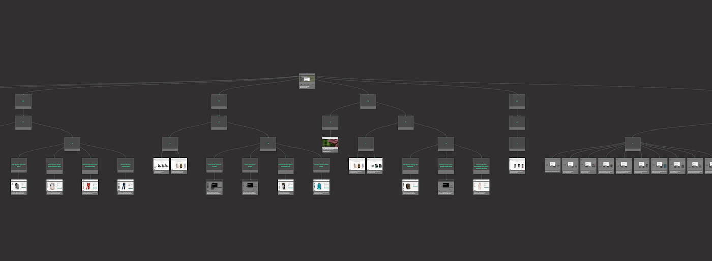
If Blue Apron’s design had this many levels, it would work against them. But for Burton, a more complex taxonomy simplifies their many products into an easier to navigate system.
Having a visual representation of what’s in place shows you whether or not the hierarchy is flat or deep, and helps you come up with a plan in how you can improve it.
Know how the competition structures their websites
People want what’s familiar. They don’t want some novel, wacky way of using a website. Understanding the structure of the competitions’ web designs lets you see common patterns. It allows you to tailor your own site’s organization to follow these recognizable paths for a more intuitive experience. VisualSitemaps crawls available websites to show you how they’re set up, to help you gather this information.
A visual sitemap not only lets you redesign a website with a structure that people are accustomed to, but gives you the chance to beef up your content. By knowing what competitors are talking about, it gives you the opportunity to fill in the gaps with what they may be missing. You’re able to offer richer content. This not only helps out people reading through it, but also boosts its relevance in the eyes of web crawlers, who are able to identify what a website is all about. A more logically arranged website makes for enhanced SEO.
Visual sitemaps simplify communication
Want to wow your client? Showing up to a meeting with a sitemap is like rolling up to a pick up basketball game with LeBron James. Showing the stakeholders the current structure of their website, its problems areas, and how you’re going to improve it is a slam dunk.
Site maps show information architecture. They diagram all possible ways to navigate it. And they show how all of the components are interrelated. Everyone on a team whether they’re role is in UI, UX, content writing, SEO, or business strategy can see right in front of them the taxonomy. This makes for better feedback, questions, and optimizing meeting times.
And how many of us have spent undue time capturing screenshots and then sending them out by email, Trello, or Jira, in communicating with our team-members or clients? You might as well draw everything out on paper and strap it onto the leg of a carrier pigeon and send it on its way.
There’s a more efficient way to do things. VisualSitemaps has the powerful feature of screenshot annotations which lets you make comments in real-time. When everyone on a project can share their ideas quicker, and see the comments in the context of the site map, it transforms this part of the process. Instead of a slow exchange shrouded in confusion, collaboration becomes clear and concise.
And best yet, we’re willing to keep it a secret how easy it is to create one, and will let you take all the credit. Pretty nice of us, right? Shhh…
Level up your Design & UX
Most of us assimilate information by taking it in visually. Visual sitemaps illuminate the intricacies of a website’s framework. This goes beyond just giving a rudimentary understanding, but provides data, transforming the redesign experience into an exact science.
What was once a painstaking process of creating an in-depth sitemap can now be done in a few clicks. Let VisualSitemaps give you the insights you need to enhance your design work, and propel your work process.